DellCase 01 · Enterprise B2B

From fragmentation to a multi-year Partner Experience vision.

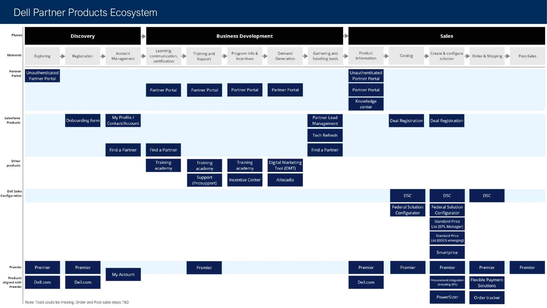
Partners were moving across 70+ tools and interfaces with inconsistent UI and fragmented ownership. In one key reseller journey, they had to move through 5–6 different tools just to complete a purchase. It was a broken experience. I led the design work to map the ecosystem, align teams and define a simpler, more coherent direction.
RolePrincipal / Senior Principal Product Designer · Design Lead
ScopeGlobal B2B Partner Experience · platforms · journeys
Leadership5-person design team + Product, Engineering, Research & Business partners
Dell Partner Products Ecosystem mapping
Image representing the main product mapping. Selected portfolio and platform decisions are omitted for confidentiality.
The strategy

Make the system visible. Then make it simpler.

The multi-year vision focused on improving efficiency, reducing friction across products, and increasing self-service so partners could complete more work with less support.

AI was part of that direction: identify where discovery, recommendations and workflow assistance could reduce clicks, shorten time-to-task and help partners act more autonomously.

See the systemMap products, journeys, pain points and dependencies instead of optimizing one screen at a time.
Align the organizationCreate a shared view of priorities and use research and design evidence to move teams with different goals in the same direction.
Design for autonomyReduce friction, improve findability and explore AI-enabled paths toward faster, more self-service workflows.
Proof 01 · Partner Portal

Turn the vision into measurable change.

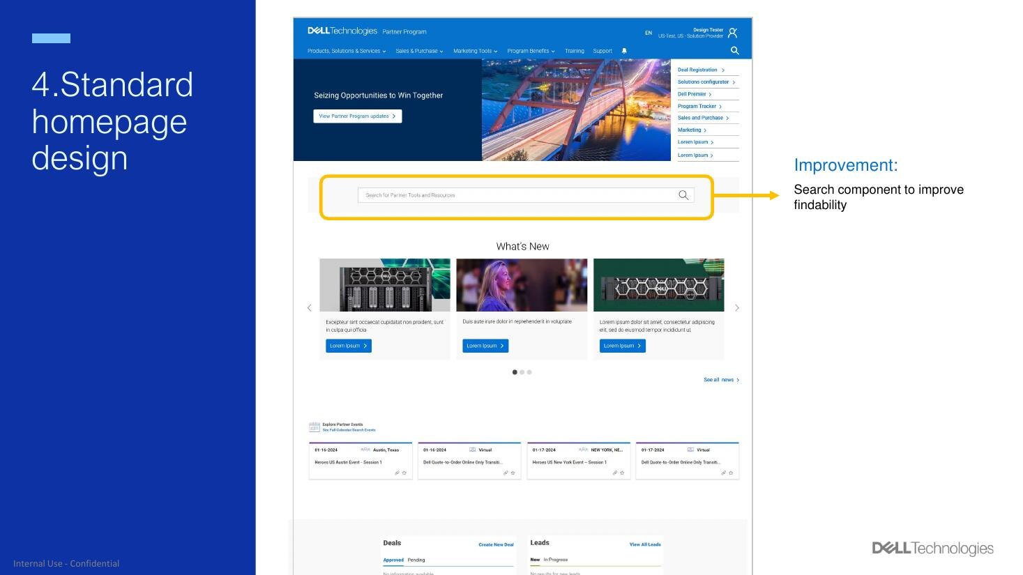
Partner Portal homepage showing an improved search component

Partner Portal was the number one stop for 450,000 partners and a high-value place to prove that clearer hierarchy, stronger search and reusable templates could improve the experience at scale.

+20.7%Partner Portal CSAT increase
+37.54%Partner Portal search click-rate increase
300+landing pages supported through reusable templates and guidance
Proof 02 · Salesforce

Use a product migration to influence the system behind it.

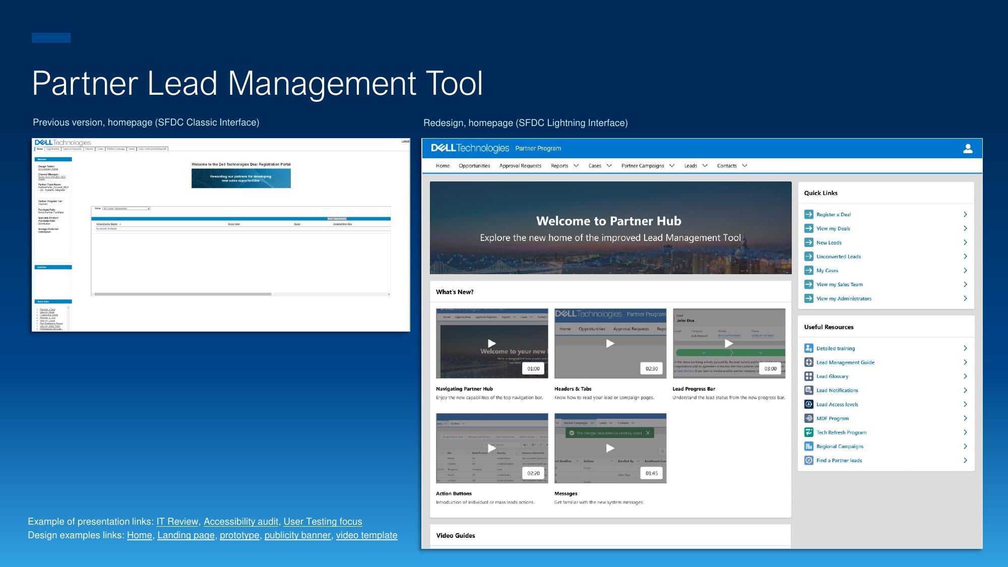
Partner Lead Management before in Salesforce Classic and after in Salesforce Lightning

During the move from Salesforce Classic to Lightning, I redesigned the experience and used the migration to push accessibility beyond our own product. I documented contrast issues in texts and icons, worked directly with Salesforce, and those requests later informed Lightning / SLDS improvements.

100%of 9 usability-test participants preferred the new interface
+3.96%Leads touched by partners in the first two months
WCAG AAcontrast gaps identified in Lightning text and icon components

“The most straightforward and easy to understand process Dell has ever provided us.”CDW Titanium Partner · feedback on the redesigned lead-management experience

How I led

Raise the quality of decisions, not just deliverables.

I coordinated designers, negotiated access to users, facilitated workshops and executive conversations, and helped teams use research and metrics to make decisions.

One of the strongest shifts was cultural: the Channel Partner business moved from being resistant to partner interviews and usability testing to actively participating and asking for the results.

Next case

Building Product Design from 0→1 while integrating Drinks&Co after acquisition.

Next story →